Created by David English, s1752527@sms.ed.ac.uk, on 4/12/20
For additional information and documentation on the packages used in this tutorial, please follow this link: https://github.com/de356/grid_tutorial
This tutorial was created as part of the Data Science in Ecology and Environmental Science course taught at The University of Edinburgh.
Table of Contents
By the end of this tutorial, you should be able to answer all of the questions and work with all of the concepts described in each section below:
Introduction
- System and user prerequisites
- What is a grid?
- What are grobs?
Using the grid Package
- Viewing & Modifying
ggplotGrob Elements - Creating Basic Graphics and Drawing with the
gridPackage - Using Viewports
Inserting Tables and Images into ggplot as Grobs
- Creating and Customising Table Grobs in R
- Inserting Grobs in
ggplotwithannotation_custom() - Importing and Converting Images Into
ggplot
Using grid.arrange() to Customise a Figure’s Appearance
- Basic
grid.arrange()Grob Placements - Changing the Relative Size of Grobs
- Layout Matrices
Creating Informative & Engaging Text Grobs with gridtext
- Basic
gridtextGrob Function - Beautifying Text Grobs
- Inserting a Text Grob Into
ggplot
Putting It All Together
- Challenge yourself with an exercise that uses all of the skills you’ve learned!
Conclusion
- Summary of everything that has been learned throughout the duration of this tutorial.
Introduction
Oftentimes when we’re visualising data in R, it may be the case that we want to combine multiple different graphics or images into a single figure, or customise a plot in such a way that cannot be easily done using ggplot features alone. When we need to do this, look no further than the grid package family for (most) all plotting issues! grid, and it’s associated packages gridExtra and gridtext contain neat attributes that can allow you to take your multi-figure data visualisation to the next level! This tutorial will serve as a broad overview of the most useful and accessible features of these packages; to try and cover everything we would probably need to write an entire book (some have!). There are also several other packages within the grid graphics family that can allow for greater flexibility and application; I’m highlighting those that the average R user will likely find to be the most useful for everyday use.
System and User Prerequisites
For this tutorial, we use and recommend that you use RStudio for running all of the code that is used in this tutorial. If you do not already use this programme, we highly recommend you download it at this link. If you’re using a different Integrated Development Environment (IDE), some of the instructions and work done in this tutorial may seem confusing at times.
We’re also assuming that the reader is already familiar with using ggplot2 and it’s various functions, as well as some of the other features and packages found within the tidyverse. While understanding the properties and functions of ggplot is not essential, it will certainly help with your understanding of some of the code that is working in the background as we go through this tutorial. If you want to learn more about ggplot2 and data visualisation in general, I’d recommend using the following links:
https://ourcodingclub.github.io/tutorials/datavis/
https://ourcodingclub.github.io/tutorials/data-vis-2/
All of the files relevant for the completion for this tutorial, as well as some supplementary information, can be downloaded from the following repository.
Once you’ve downloaded this repository, open up RStudio and create a new R script that you can use to work through this tutorial. In RStudio, go to File/New File/R Script to do this. We’ll take this moment to set up some of the other properties of the R script we’ll be using throughout the tutorial.
First we’ll import all of the packages that we’re planning on using in this tutorial. Don’t worry if you’re not yet familiar with all of the packages listed, we’ll visit them all throughout the course of the tutorial.
# Import packages that will be used in this tutorial.
library(tidyverse)
library(imager)
library(grid)
library(gridExtra)
library(gridtext)
The grid package is included with more recent versions of R and RStudio, and doesn’t need to be installed, even if it’s your first time using it. For all other packages, use the install.packages() function to install them if you haven’t used them before.
If you’ve downloaded the tutorial repo, then we’ll want to set our working directory so that RStudio will be able to locate the other files that we’ll be working with for this tutorial. The example script in this tutorial uses relative file pathways that will only work if you’ve set your working directory to the repo folder!
# Set working directory
setwd("Insert the file pathway to your downloaded repo here")
For those working in RStudio, we’ll be using the iris dataset (an R tutorial classic!) for all of the plots and features that we create. This dataset comes built into R. This means that we do not need to import data from outside RStudio. If you’re not using RStudio, you can find a CSV file of the iris dataset in the data folder of the tutorial’s repo. Let’s enter some code to make the iris dataset explictly appear in our working environment, the have a look at what it’s contents are.
# Insert the iris dataset into your project environment
iris <- iris

# Look at some of the contents of 'iris'
head(iris)
The dataset is a collection of measurements of the length and width of the sepals and petals of iris flowers. There are 4 continuous variables of the different size measurements, and one categorical variable that specifies to which species of iris flower the measurements belong. We can create a number of different plots from this dataframe and represent and manipulate them using grid graphics.
What Is a Grid?
A grid, or more correctly grid graphics in R’s case, is the graphics system that underlies plot and image creation. Over time, grid graphics have proven to serve such an important purpose in R that later versions of RStudio come with the package built-in. It is a very basic package, not in that it is easy to use, but rather in the many functions it contains one can create basic, relatively unpolished shapes and grob assets. Many properties and abilities of R’s grid graphics system are better-handled by other packages that have been created over time for more streamlined graphics creation.
What Are Grobs?
At the heart of grid graphics and the grid package (and a word we’ll be using a lot in this tutorial) is the grob, or graphical object. In R, we create regular objects in the form of dataframes, matrices, or vectors which contain numeric or string data. A grob is different from these in that the data it stores is a collection of assets and features which, when compiled, create some image or graphic. Grobs can be as simple as a single shape or line, or as complex as a multi-faceted plot. We’ll illustrate this concept in better detail later on.
Using the grid Package
Although grids may seem like a novel concept at first glance, you’ve actually likely been working with them in depth for a while without realising it! ggplot2 is built on the back of grids, and it employs much more user-friendly conventions for creating plots and data visualisations that would have taken a lot more effort to create directly using base features of the grid package. Think of grid as being the language that ggplot speaks (whenever you import the ggplot2 library into R, you also import the grid library because ggplot2 requires it to function correctly). Given this, it’s useful to understand how the grid package works and how its functions can be applied to data visualisation. Given that there are other packages that make it far easier to manipulate most assets within the grid package, we won’t be covering most of its features, but rather give a broad introduction into some of its essential properties, as well as some of its unique features that still can’t be easily utilised through other packages. The average R user won’t interact with the majority of grid functions, and if they do, it would usually be for a very specialised task. ggplot is being continuously updated with new changes so as to make it easier to use, so direct interaction with the grid package will become less and less necessary over time.
Viewing & Modifying ggplot Grob Elements
To illustrate the prevalence of grobs and the grid package in data visualisation, let’s use ggplot to create a basic scatterplot.
# Create a basic scatterplot with a linear regression
iris_plot <- ggplot(iris, aes(x = Sepal.Length, y = Petal.Length)) +
   geom_point(aes(color = "red")) +
   stat_smooth(method = "lm") +
   theme_classic() +
   theme(legend.position = "none") +
   labs(x = "Sepal Length",
        y = "Petal Length")
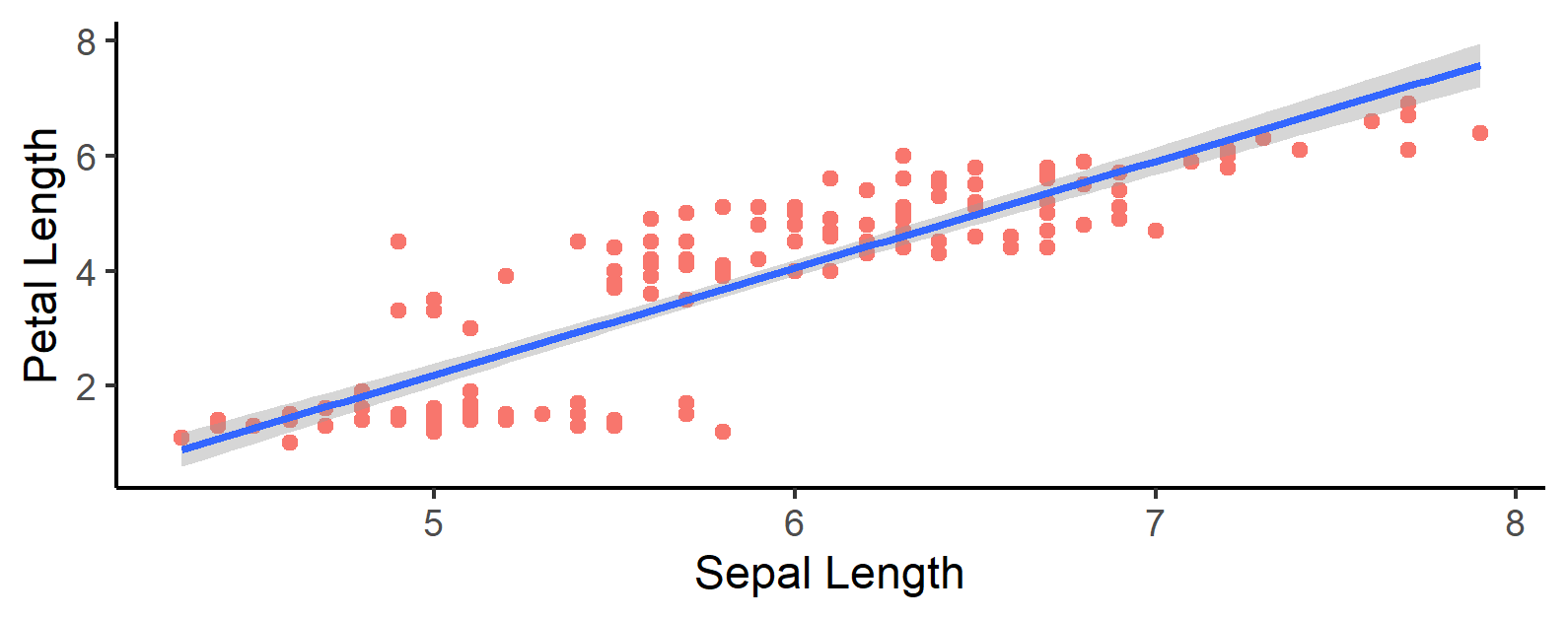
At this stage, you’ve likely made plots of this kind before, but have you ever considered what was running and created in the background to create them? In your R script, immediately after running the code you used above to create the scatterplot, run these two additional lines of code:
# Look at the different grob assets of the scatterplot
grid.force()
grid.ls()
Most grobs, such as those made in ggplot, don’t generate their content until they are drawn on your local graphics device. We use grid.force() as a way of forcing the console to generate plot contents so that we can examine them using the grid.ls() function, which returns a list of the grobs that we’ve created as part of our larger scatterplot graphic. To see the grob layout of a ggplot graphic, you must run both of these functions immediately after you create or call the graphic in your code, otherwise grid.ls() will likely only printout the word 'layout' in your console. After running both of these correctly, your console will give you a long laundry list of different assets and functions you’ve likely never seen before. By some of the grob names in the list, you can probably guess what they do or what they create. This is what I see after running those two lines of code:
layout
  background.1-9-12-1
  panel.7-5-7-5
    grill.gTree.2254
      panel.background..rect.2249
      panel.grid.minor.y..zeroGrob.2250
      panel.grid.minor.x..zeroGrob.2251
      panel.grid.major.y..zeroGrob.2252
      panel.grid.major.x..zeroGrob.2253
    NULL
    geom_point.points.2238
    geom_smooth.gTree.2245
      geom_ribbon.gTree.2242
        GRID.polygon.2239
        GRID.polyline.2240
      GRID.polyline.2243
    NULL
    panel.border..zeroGrob.2246
  spacer.8-6-8-6
  spacer.8-4-8-4
  spacer.6-6-6-6
  spacer.6-4-6-4
  axis-t.6-5-6-5
  axis-l.7-4-7-4
    GRID.polyline.2262
    axis
      axis.1-1-1-1
        GRID.text.2263
      axis.1-2-1-2
  axis-r.7-6-7-6
  axis-b.8-5-8-5
    GRID.polyline.2257
    axis
      axis.1-1-1-1
      axis.2-1-2-1
        GRID.text.2258
  xlab-t.5-5-5-5
  xlab-b.9-5-9-5
    GRID.text.2267
  ylab-l.7-3-7-3
    GRID.text.2270
  ylab-r.7-7-7-7
  subtitle.4-5-4-5
  title.3-5-3-5
  caption.10-5-10-5
  tag.2-2-2-2
Don’t worry if your output has different numbering than the one you see above; it will vary from console to console (session to session, even!). The many lines that you see above and in your console is a list of all of the different grobs that were used and created from grid package assets to create the finely polished output that we see in our scatterplot. Each line represents a particular graphical object, such as the label for the y axis in our plot (GRID.text.2270), or the different data points in our scatterplot (geom_point.points.2238). While ggplot has been formatted to make changing the properties of most grobs an easy process through the use of functions like aes(), we can go into this base grid code and make changes to our plot that might otherwise be more difficult to accomplish with ggplot. For example, if we wanted to change the colors and linetype of the x and y axes, we could display all of the different grobs within our code, find the specfic names of the grobs that created the two axis lines, then use the grid.edit() function to change some of the grobs’ properties.
# Edit some properties of the iris scatterplot
grid.edit("GRID.polyline.2262", gp = gpar(col="red", lty = "dashed", lwd = 2))
grid.edit("GRID.polyline.2257", gp = gpar(col="red", lty = "dashed", lwd = 2))
Remember: The exact name of the grob that you want to edit will be different from those named above. Every time that you run the code to produce a plot, even it is within the same session, the grob shall be given a new, unique name that must be checked using grid.ls().
Executing those two grid.edit() functions gives the following output on our local graphics device:
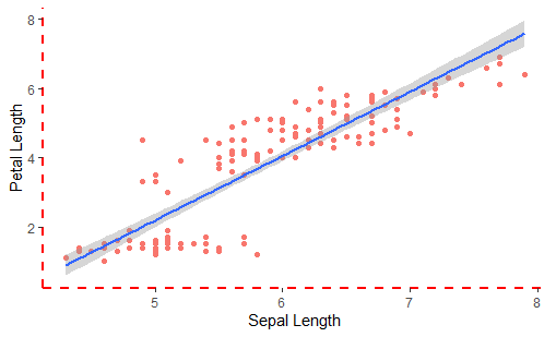
Notice within the grid.edit() function that we also use the gpar() function, which is short for grid parameter. This function allows you to specify and change different aesthetic properties of the grob that you’re working with such as it’s height (lineheight), color (col), line type (lty) or line width (lwd), as well as several others. On a more basic level than manipulating and changing some of the underlying features of a ggplot plot, however, grid gives us the ability to create unique images and shapes.
Creating Basic Graphics and Drawing with the Grid Package
Another useful feature of the grid package which has still maintained relevance is its ability to create various shapes on RStudio’s graphics device (‘graphics device’ is a more technical name for the plot window in RStudio). grid has within it a subset of functions that allow the user to create unique images and shapes. Here’s a list of some of the basic shapes and grobs that are commonly made using grid package functions:
| Function | Purpose |
|---|---|
rectGrob(x, y, width, height) |
Draws a rectangle |
roundrectGrob(x, y, width, height) |
Draws a rectangle with rounded edges |
circleGrob(x, y, r) |
Draws a circle |
segmentsGrob(x0, x1, y0, y1) |
Draws a straight line from (x0,y0) to (x1,y1). |
curveGrob(x1, y1, x2, y2, curvature, angle) |
Draws a curve from (x1,y1) to (x2,y2). |
textGrob(label, x, y) |
Draws a textbox |
polygonGrob(x, y) |
Draws a polygon, where the final x and y coordinates automatically connext with the first x and y coordinates. |
rasterGrob(image) |
Convert a raster (type of image) into a grob |
In gridExtra Package: |
|
ellipseGrob(x, y, size, angle, ar) |
Draws an ellipse |
Note: There are other shapes that are possible to create with the grid and gridExtra packages, but these are the ones most commonly used.
It’s important to clarify that all of the functions above will create grobs in your session, but they will not actually draw them on your graphics device. If you want to draw grobs, then you should use the grid.("shape name") set of functions to draw an graphic, such as grid.segments() or grid.roundrect(). These types of functions accept the exact same parameters as the "shape name"Grob() type of functions specified above.
Important note before continuing: If you draw the following shapes on your graphics device without first clearing the graphics device, the console will draw directly over the plot that we created earlier! Generally before running code, especially with grid graphics, it is advised to first run the dev.off() function. This will clear your graphics device at the point specified within your script, and give the console a clean slate on which to draw. Whenever you’ve created the shape(s) you desire, use the png() function to save the output to your local hard drive. You need to insert png() at the point at which you want the console to start saving the images that you’re drawing, and the dev.off() function will specify when to close the graphics device and stop saving whatever has been drawn. You do not need to use dev.off() when working with plots made exclusively with ggplot, as ggplot has been designed so that plots don’t overwrite one another, but are instead all stored separately in the local memory of the graphics device and can be navigated between!
Let’s draw some basic shapes to better understand grob creation!
# Draw basic shapes using the grid package.
basic_rect <- grid.rect(x = 0.5, y = 0.5, width = 0.9, height = 0.2, gp = gpar(fill = "red"))
basic_circle <- grid.circle(x = 0.5, 0.8, r = 0.1, gp = gpar(fill = "yellow"))
basic_circle2 <- grid.circle(x = 0.5, 0.2, r = 0.1, gp = gpar(fill = "yellow"))
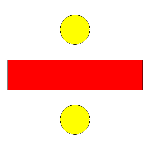
Where x and y represent the grid coordinates on which the shape is centered. Grid grobs use the grid coordinates system for determing their position, where each coordinate can take on a minimum value of 0 and a maximum value of 1. Notice how we once again used gpar() when specifying some of the aesthetic attributes of the different shapes. Creating a division symbol is a pretty simple arrangement, as it only took us 3 lines of code to produce. If we wanted to keep these shapes together in this position, appearance, and size relative to one another we could use the gTree() function. gTree() accepts several different grobs as its parameters and merges them together to make a single, unique, multi-asset grob. Let’s do this with the single-shape grobs that we defined above and merge them together into a new graphic.
# Combine these shapes into a single grob using the gTree() function
division_sign <- gTree(children = gList(basic_rect,
                                       basic_circle,
                                       basic_circle2))
grid.draw(division_sign)
Important note: The division_sign grob would not appear in the ‘plot’ panel of RStudion until you run the grid.draw() function. This is because the first line only creates the object in our environment, but the does not actually draw it. You’ll often need to use grid.draw() when working with grid, as creating and drawing are two separate tasks for the console.
Upon running the grid.draw() function, you’d find that you’ve produced the exact same image that we did above, but we can call the single gTree object instead of having to call each individual grob separately. You’ve probably also noticed that we have this unusual parameter, children, in our gTree function. children is an oddly-worded way of defining what grobs compose the larger, multi-graphic grob we wish to create, which we provide through a grob list (glist()). Let’s try to do this again by creating a more complex multi-shape grob. In the spirit of using the iris dataset, let’s create a basic image of a flower. While grid provides functions to create some basic shapes and curves, additional shapes, such as ellipses, have been introduced by other downloadable packages such as gridExtra. See the code below for how we combine several different shapes together to make our image.
# Let's make a grob that's a bit more complicated...
sunflower <- gTree(children = gList(
  segmentsGrob(x0 = 0.5, x1 = 0.5, y0 = 0, y1 = 0.5, gp = gpar(col = "green", lwd = 8)),
  ellipseGrob(x = c(0.5, 0.5, 0.37, 0.63, 0.42, 0.57, 0.42, 0.57),
              y = c(0.75, 0.45, 0.6, 0.6, 0.5, 0.7, 0.7, 0.5),
              size = 7, angle = c(2*pi, 2*pi, pi/2, pi/2, pi/4, pi/4, 3*pi/4, 3*pi/4),
              ar = 1/3, gp = gpar(fill = "yellow")),
  circleGrob(x = 0.5, y = 0.6, r = 0.1, gp = gpar(fill = "brown"))))
grid.draw(sunflower)
This will draw the following image on our graphics device:
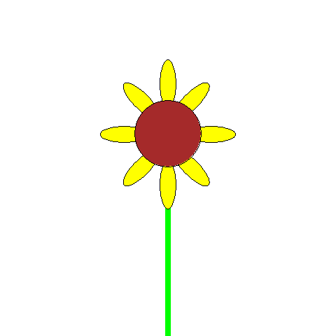
Wow! We’ve managed to make our multi-object grob, a cute little sunflower, but as you can see it takes a lot of code to make even relatively simple images. Imagine how many lines it would take to make something much more complex! With a lot of time and patience, it’s possible to make incredibly intricate images using grid graphics, and it’s getting easier all the time with additional grid tools such as those found in gridExtra.
It is worth noting, however, that we were able to create eight different ellipses through a single call to the ellipseGrob() function. One of the great features of the grid package is that we can pass on a vector to numeric parameters instead of a single value. This way, so long as we know how we want to position shapes, it can significantly cut down on the amount of work both ourselves and our console need to do. Along with vectors, we can also further streamline the graphic creation process by passing on mathematical equations to numeric parameters instead of vectors, which will allow us a systematic way of creating complex shapes and figures. Below is a common example of the power of mathematics in the grid package in action.
# Graphics creation using mathematics - create 100 circles
math_circles <- grid.circle(x=seq(0.1, 0.9, length=100),
            y=0.5 + 0.4*sin(seq(0, 2*pi, length=100)),
            r=abs(0.1*cos(seq(0, 2*pi, length=100))),
            gp = gpar(fill="green"))
grid.draw(math_circles)
Base code courtesy of: https://www.stat.auckland.ac.nz/~paul/RGraphics/chapter5.pdf
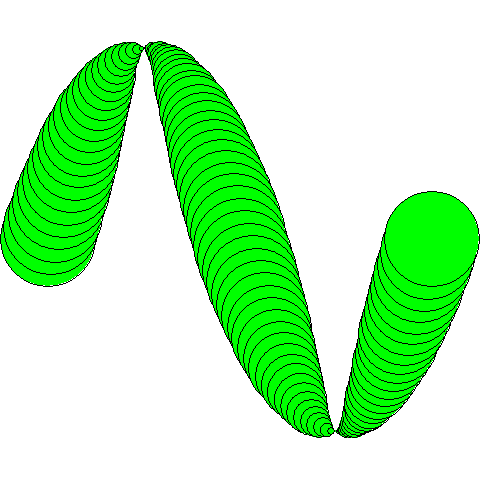
We created one hundred circles using only a single call to grid.circle(), and we specified our grid coordinates in such a way that we used no vectors. Pretty cool!
Now that we’ve made our grobs composed of multiple different assets, we can insert this into other grobs using the viewport function of the grid package!
Using Viewports
Another important concept in using grid graphics is that of viewports. Viewports are effectively smaller workspaces that exist within our graphics device that we can work within and move into and out of to provide a greater level of customisation to the graphics that we are trying to create. They are especially useful if we have a multiple grobs or plots that we want to show side by side. A common example of this you’re probably already familiar with is the use of facets in ggplot plots. Each facet exists within it’s own smaller workspace in our main graphic, but all these different smaller workspaces are still apart of a single, larger workspace where we can view all facets. Confused? It’ll make sense soon! Read on below!
As was the case with grobs, you’ve probably already been using viewports quite a bit in data visualisation, but ggplot has made working with them so simple that you never realised it. Let’s revisit the iris_plot object that we made earlier, but this time let’s filter the layout list to only return viewports.
# Examine the different viewports in the iris_plot scatterplot
iris_plot
grid.force()
grid.ls(grobs = FALSE, viewports = TRUE)
Produces the following output:
ROOT
  layout
    background.1-9-12-1
      1
    panel.7-5-7-5
      1
    spacer.8-6-8-6
      1
    spacer.8-4-8-4
      1
    spacer.6-6-6-6
      1
    spacer.6-4-6-4
      1
    axis-t.6-5-6-5
      1
    axis-l.7-4-7-4
      GRID.VP.1153
        axis
          axis.1-1-1-1
            GRID.VP.1151
              GRID.VP.1152
                3
          axis.1-2-1-2
            1
          1
        2
    axis-r.7-6-7-6
      1
    axis-b.8-5-8-5
      GRID.VP.1150
        axis
          axis.1-1-1-1
            1
          axis.2-1-2-1
            GRID.VP.1148
              GRID.VP.1149
                3
          1
        2
    xlab-t.5-5-5-5
      1
    xlab-b.9-5-9-5
      GRID.VP.1154
        GRID.VP.1155
          3
    ylab-l.7-3-7-3
      GRID.VP.1156
        GRID.VP.1157
          3
    ylab-r.7-7-7-7
      1
    subtitle.4-5-4-5
      1
    title.3-5-3-5
      1
    caption.10-5-10-5
      1
    tag.2-2-2-2
      1
    1
There’s quite a few viewpoints even in a single scatterplot! But how can we explicitly create and use them?
First, within our main workspace, we want to define the size and position of where a viewpoint is going to be. For this we use the viewport() function.
# Create a viewport
iris_vp <- viewport(x = 0.75, y = 0.25,
                    width = 0.25, height = 0.25,
                    just = c("left", "bottom"))
Using x and y grid coordinates, we have established where we want our viewport to be positioned, and the justification (just) tells the console what corner of the viewport to place on the given x,y coordinates. In this case, the bottom left-hand corner of our viewport will be positioned at (0.75, 0.25).You can also properly center your viewport on the grid coordinate position by using just = c("center", "center").
With this, we’ll now introduce two important functions for moving between viewports: pushViewport() & popViewport(). Push lets you view and work within the viewport that you’ve defined (such as iris_vp), whereas pop takes you out of the current viewport that you’re working in and allows you to look at the big picture: the whole graphic that you’re creating.
# Let's insert viewports in our plot.
iris_plot
pushViewport(iris_vp) # Start working within our viewport
  grid.draw(roundrectGrob(x = 0.5, y = 0.5, width = 1, height = 1))
  grid.draw(division_sign)
popViewport() # Leave viewport; looking at whole graphic
Which gives us the following:
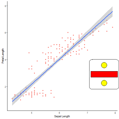
Let’s review what we just did in the above code, line by line. First, we called and drew iris_plot on our graphics device, we want this to be the primary grob that we display on our main workspace. After that, we use the pushViewport() function, calling within it the viewport object that we had created earlier. After executing this line of code, we are now working within a viewport, the size and position of which we defined when we created iris_vp, and we can add and edit most any kind of grob within this workspace without worrying if it will impact the iris_plot figure that we drew in our main workspace. Now that we’ve entered into a viewport, we draw two grobs; a rounded-edge rectangle which occupies the perimeter of our viewport, and the division sign gTree grob that we created earlier. After having drawn these two, we execute the popViewport() function which takes us out of the viewport in which we drew the two shapes, and back to our main workspace, occupied by iris_plot, so that we can see both the scatterplot as well as the symbol that we created.
Note: The reason we didn’t use the sunflower grob that we created previously is because the ellipse shapes currently do not scale down to the size of the viewport window when they are placed therein. This may be corrected with a future update to the gridExtra package.
Another great property of viewports is that you can nest them within one another. Let’s demonstrate this by doing the same thing that we just did above, but this time we’ll introduce two viewports. We’ve indented the code to better illustrate how viewports are being nested within one another.
# Let's try nesting viewports within one another.
iris_plot
pushViewport(iris_vp) # Enter first viewport
  grid.draw(roundrectGrob(x = 0.5, y = 0.5, width = 1, height = 1))
  grid.draw(division_sign)
  pushViewport(iris_vp) # Enter another viewport within our first viewport
    grid.draw(roundrectGrob(x = 0.5, y = 0.5, width = 1, height = 1))
    grid.draw(division_sign)
popViewport(2) #Exit 2 viewport levels; return to main workspace
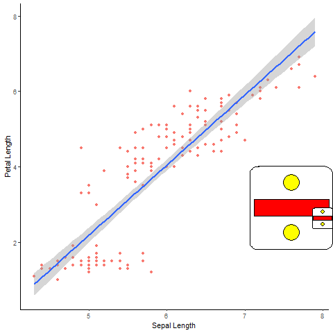
The process that we performed above was very similar to our first viewport plot, but you’ll notice that there is now a second, smaller viewport with identical contents to the first viewport that we created. After drawing the rectangle and division sign, you’ll notice that we called the pushViewport() function again, giving it the same iris_vp function that we gave our first viewport. Since we were already working within a viewport when we called this function a second time, the second instance puts us into a new, second viewport within our first viewport that is at the same position that our larger viewport is in our main workspace (A written explanation is a bit confusing, but hopefully the code and figure better illustrates the concept). We create the exact same objects that we did in our first viewport and then call popViewport() to return to our main workspace. Notice the number ‘2’ in our function, that’s us telling the console that we want to exit from the two viewport levels we’ve created. If we had not passed on any numeric value to popViewport(), any additional changes we make to the code would be drawn only in the first, larger viewport we’ve created.
While some of the imagery that we’re using is a bit basic, we hope that the underlying power of these tools is becoming apparent. If we wanted to be a bit more utilitarian with how we use viewports, let’s create a histogram that we would like to insert into our scatterplot:
# Let's create a histogram to insert into our scatterplot
(iris_histogram <- ggplot(iris, aes(x = Petal.Length)) +
    geom_histogram(bins = 10, aes(fill = "red")) +
    theme_classic() +
    theme(legend.position = "none"))

# Let's use viewports to insert this histogram into iris_plot
iris_plot
pushViewport(iris_vp)
  grid.draw(ggplotGrob(iris_histogram))
popViewport()
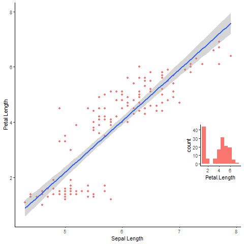
Voila! Now we know the relationship between petal and sepal length, as well as the distribution of petal length in our dataset all in a single figure! When we drew the histogram in our viewport, you’ll see that we used the ggplotGrob() function. This is because ggplot plots are a collection of several different assets and grobs, and grid.draw() is expecting that its parameters are going to be only grobs. As such, we need to convert this histogram into being a grob so that it can be easily drawn with grid graphics, but don’t worry! You’re not losing any information in converting your histogram from a gg object to a grob. As you’ll see below, ggplot has some built-in features which allow us to directly insert grobs and other plots into a ggplot plot without having to use viewport functions.
As we said at the beginning, this is only a brief introduction to everything that the grid package has to offer, but we’ve highlighted some of its most important features. We encourage you to have a look at some of the grid package’s documentation to see what other functions are available. Keep in mind that new packages that allow for easier use of grid graphics are being made all the time, and while grid is still an incredibly important package, direct interaction with it is becoming less and less common. We hope that this introduction to what exactly grids are and what makes them tick has been useful! Now we’ll move onto assets and external packages that you’re more likely to use in your everyday coding and ggplot data visualisation!
Inserting Tables and Images Into ggplot As Grobs
Now that we have an understanding of what grids are and some of their features, let’s start using them in ways that ggplot doesn’t let us! As the name suggests, gridExtra adds some additional functionality and features for manipulating grids and graphics that we wouldn’t otherwise have. The two biggest additions the package makes is the ability to create grob tables and easily arrange multiple grobs together into a single figure. We show how to use both of these features below.
Creating and Customising Table Grobs in R
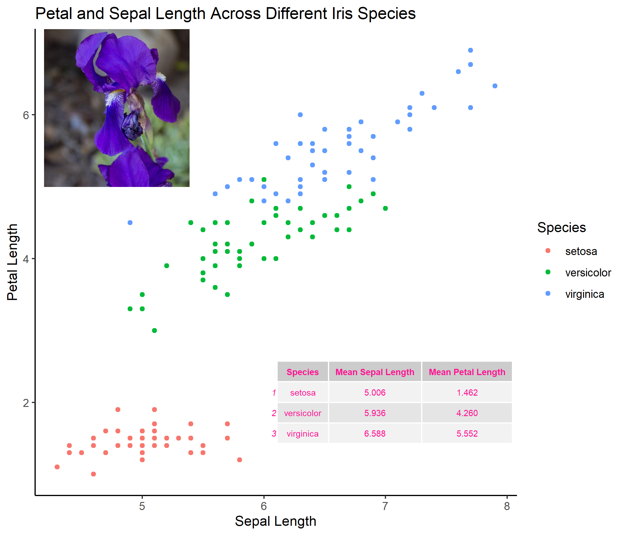
Let’s say that we wanted to create a basic scatterplot in ggplot showing the relationship between the sepal length and petal length of irises across different species.
# Creating a basic scatterplot with ggplot
(iris_scatter1 <- ggplot(iris, aes(x = Sepal.Length, y = Petal.Length, color = Species)) +
   geom_point() +
   theme_classic() +
   labs(title = "Petal and Sepal Length Across Different Iris Species",
        x = "Sepal Length",
        y = "Petal Length"))
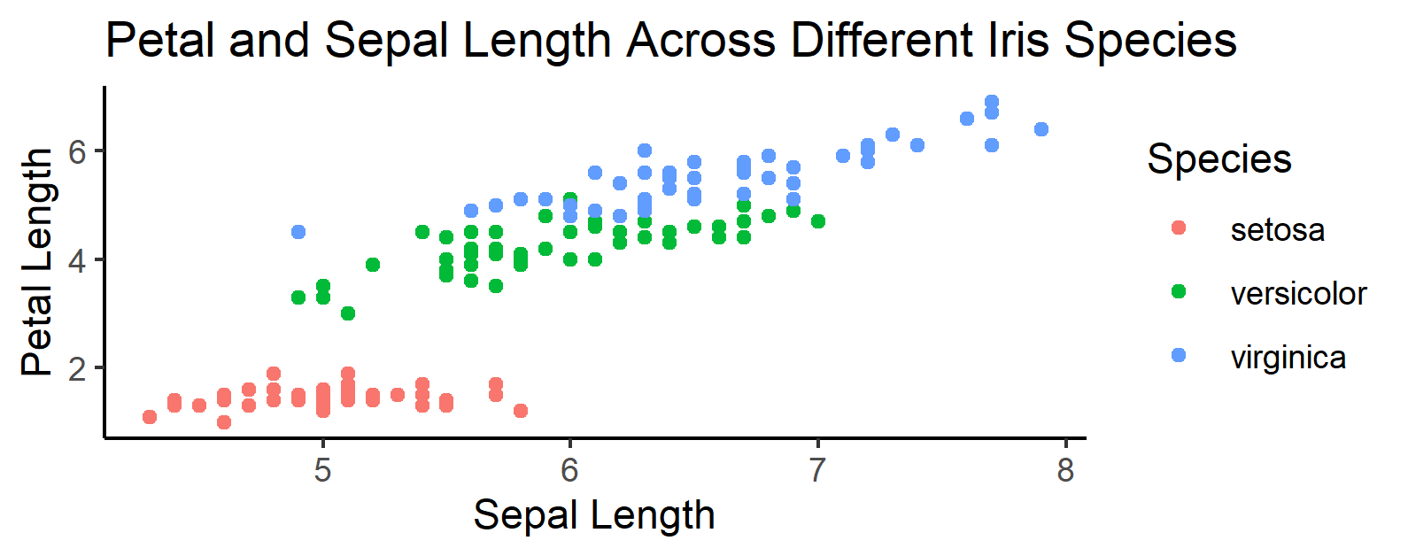
While this image alone is useful and informative, perhaps we want to add some additional information to better highlight some properties of the data. Namely, what would we do if we wanted to add a table to this scatterplot, showing the average length and width of petals for each iris species in our dataset? Thankfully, gridExtra makes this a relatively easy task!
The gridExtra package adds the function tableGrob(), which quickly and painlessly converts a dataframe into a grob which can interact with objects made in ggplot. Using the dplyr package in the tidyverse, let’s create a new dataframe that contains the average petal and sepal lengths:
# Creating a basic tableGrob using pipes dplyr features
mean_length1 <- iris %>%
  group_by(Species) %>%
  summarise(mean_sepal_l = mean(Sepal.Length),
            mean_sepal_w = mean(Petal.Length)) %>%
  tableGrob()
grid.draw(mean_length)
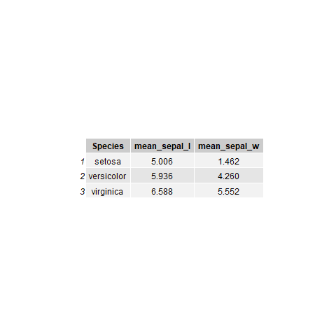
Terrific! But we can still do more! Remember, this table is now a grob, so we cannot actually make any changes to it at this stage, since it’s an image. If we want to make the table a bit more reader-friendly by changing variable names or other variable properties, we’d have to go back and change the code we used to create the dataframe. The tableGrob() function contains useful parameters for further customising the appearance of our table, such as theme =. This parameter can be used to change the colour, size, font face or font type of a table. We can change the appearance of our code by making some changes as follows:
# Changing some of the properties of the tableGrob
mean_length2 <- iris %>%
  group_by(Species) %>%
  summarise("Mean Sepal Length" = mean(Sepal.Length),
            "Mean Petal Length" = mean(Petal.Length)) %>%
  tableGrob(theme = ttheme_default(base_size = 7,
                                   base_colour = "deeppink"))
grid.draw(mean_length2)
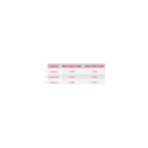
It’s already looking better! Feel free to have a look at some of the other properties and features of tableGrob() and make other changes to the table that you think would be good!
Inserting Grobs in ggplot with annotation_custom()
At this stage, we’re ready to add our table to our scatterplot! We cannot use grid.draw() to add grobs to a plot made in ggplot, but fortunately ggplot has a built-in function, annotation_custom(), which can be used for inserting grobs directly into a plot.
# Insert the tableGrob into our scatterplot
iris_scatter2 <- ggplot(iris, aes(x = Sepal.Length, y = Petal.Length, color = Species)) +
    geom_point() +
    theme_classic() +
    labs(title = "Petal and Sepal Length Across Different Iris Species",
         x = "Sepal Length",
         y = "Petal Length") +
    annotation_custom(mean_length2)
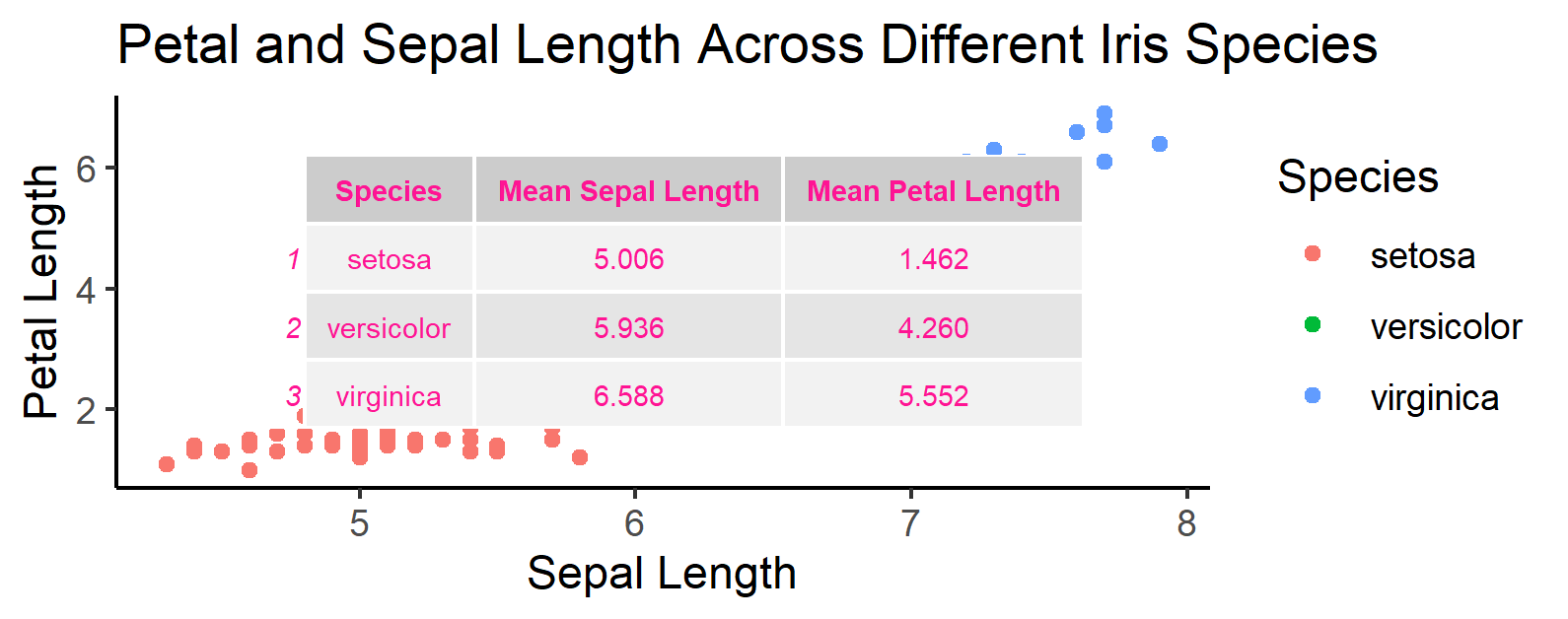
Well, we’ve got our plot and table together, but our table is a bit too in the way for what we want. annotation_custom() comes with the parameters ymax, ymin, xmax, xmin so that we can define where exactly on our plot we want our table to be, essentially allowing us to directly define and place a viewport right into our plot. These parameters position the table based upon data coordinates, not grid coordinates! This means that the values we pass onto to the x and y parameters depends upon the values in our dataset and the scale of our plot. While this makes it easier to position grobs with ggplot, your grob may not strictly obey the x and y limits you’ve defined depending upon how large it is. If the grob itself is larger than the defined limits, then you may need to alter the grob’s position and the size of your plot until everything is sized to satisfaction. We can use the following code to position our table in the bottom right-hand corner of our plot:
# Resize and reposition the scatterplot out of the way of datapoints
(iris_scatter3 <- ggplot(iris, aes(x = Sepal.Length, y = Petal.Length, color = Species)) +
    geom_point() +
    theme_classic() +
    labs(title = "Petal and Sepal Length Across Different Iris Species",
         x = "Sepal Length",
         y = "Petal Length") +
    annotation_custom(mean_length2, xmin = 6.5, ymax = 3))

Important Note! The size of the grobs you attach to your plots is dependent upon the dimensions of the image in your graphics device. If you save any of the plots made using ggsave() or png(), you may find that the plots saved onto your computer look different from the ones seen in this tutorial. If so, the dimensions of the file saved are likely different from those used to create the images seen in this tutorial. Both ggsave() and png() use height and width parameters to specify their size, and these can be set to create a larger figure where a grob occupies less space.
Great! We’ve successfully included a table in our plot and positioned it so that it doesn’t obstruct any datapoints! We aren’t limited to just doing this with tables, however, and annotation_custom() will accept most any grob regardless of what it is. For example, we apply the same method for inserting photographs into our plot, if we wanted to illustrate what an iris looks like alongside our data.
Importing and Converting Images Into ggplot
Base R doesn’t have any built-in functions for importing images, but we can use the imager package to do this. It includes the function load.image() which allows us to import images directly into our R environment. To convert this into a grob that is compatible with ggplot, we need to use the rasterGrob() function included in the grid package. A raster is a type of bitmap image that is a collection of pixels (suffice to say, it’s just a type of image). Most any PNG or JPG can be converted into a raster, and by extension can be turned into a grob.
# Import and convert image into grob
iris_img <- rasterGrob(load.image("img/iris_flower.jpg"))
dev.off() # Clears the graphics device to make way for new images.
grid.draw(iris_img)
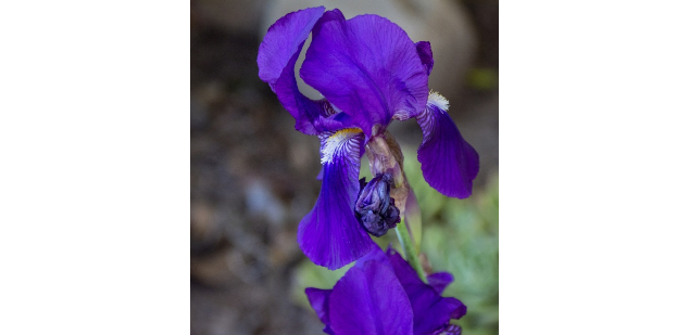
Source: https://www.publicdomainpictures.net/en/view-image.php?image=282615&picture=purple-iris-flower
A lovey iris! As with the table we created, we can use the exact same process to insert this iris image into our scatterplot.
# Insert the newly imported flower grob into our scatterplot
(iris_scatter4 <- ggplot(iris, aes(x = Sepal.Length, y = Petal.Length, color = Species)) +
    geom_point() +
    theme_classic() +
    labs(title = "Petal and Sepal Length Across Different Iris Species",
         x = "Sepal Length",
         y = "Petal Length") +
    annotation_custom(iris_img, xmin = 1.5, ymin = 5) +
    annotation_custom(mean_length2, xmin = 6, xmax = 8, ymin = 1, ymax = 3))
ggplot also included the annotate("text", label) function, which operates indetically in function to annotation_custom(), but is better suited for the creation and insertion of text and labels into a plot. It can also be used for inserting shapes such as those discussed in the previous section as well.
Using grid.arrange() to Customise a Figure’s Appearance
Now, perhaps after having done all of that, you feel that the plot was getting a little too cramped, and that it would be better for the table and photo to be included alongside the plot, but not on top of it. Great idea! Fortunately, you’re not the first person to want to do this, and somebody has already done the heavy lifting for us and made the grid.arrange() function, which is also included in the gridExtra package.
Basic grid.arrange() Grob Placements
By passing on grobs to grid.arrange() the function will position the grobs in our graphics device based upon the number of rows and columns that we define with the parameters ncol and nrow. It is also designed to be compatible with ggplot plots, meaning that one doesn’t need to call the ggplotGrob() function in order to insert plots in grid.arrange(). Referring to earlier, think of it as an easy way of creating several different viewports, but they’re positioned alongside each other, not nested within one another. Let’s make a few more plots for the sake of demonstration, and arrange them together to better illustrate this point.
# Create a boxplot for grid arrangement demonstration
iris_boxplot <- ggplot(iris, aes(x = Species, y = Petal.Length, fill = Species)) +
geom_boxplot() +
theme_classic() +
theme(legend.position = "none"))
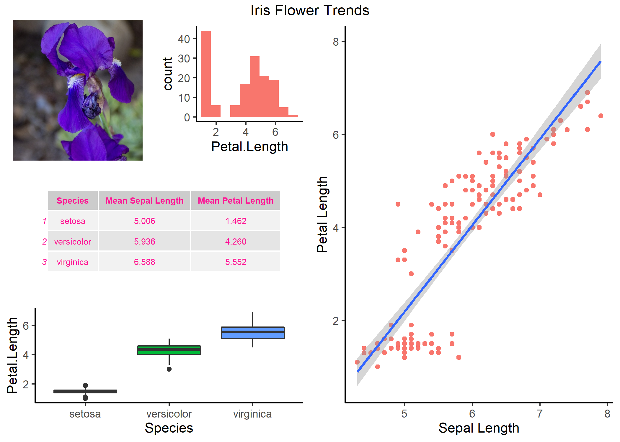
# Create a basic grid arrangement using 4 different grobs
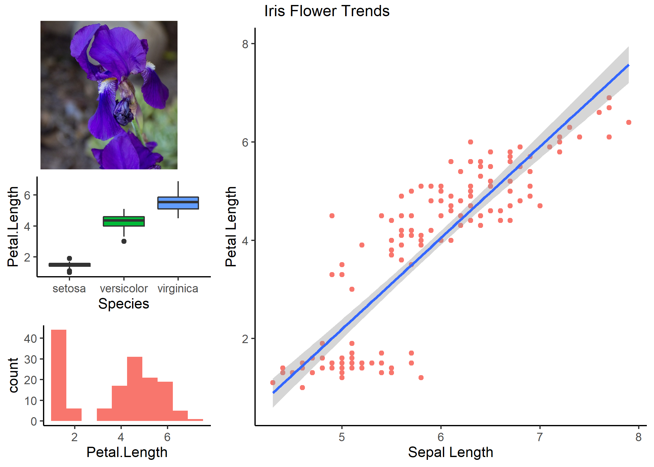
grid_arrange1 <- grid.arrange(iris_plot, iris_boxplot, iris_img, iris_histogram,
ncol = 2,
top = "Iris Flower Trends")
This gives us the following output:
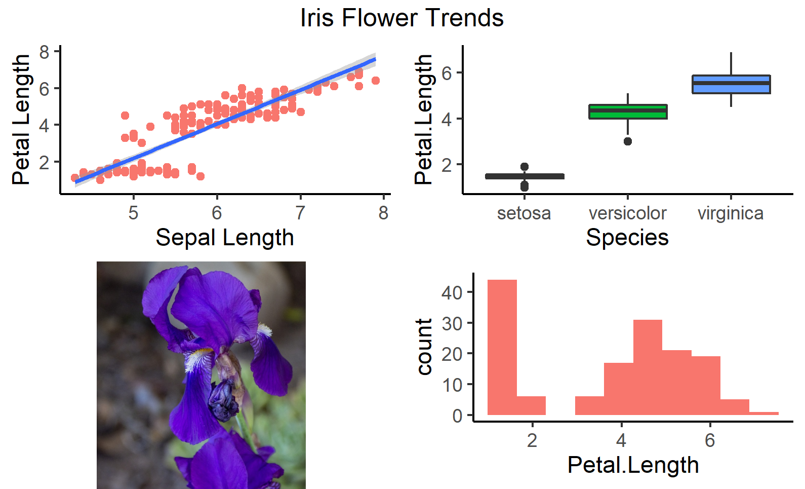
As you can see, grid.arrange() took the grobs we created and combined them into a single, four-panel figure. The ordering of the grobs in the command determines where they’ll appear on our grid, with the first grob listed appearing in the upper left-hand corner, and the next appearing in the second column of the first row. The function first fills in the entirety of each row, with a single image being placed in each column that we have defined, before moving to the row below. If we had two more images to insert into our grid, they would both be inserted onto a third, new row.
Changing the Relative Size of Grobs
We may want to draw the reader’s attention to one image in particular, however, and make one of these grobs larger than the others. One way of doing this is with the arrangeGrob() function, which we can insert multiple grobs into. When we use arrangeGrob() within arrange.grid(), the grobs within arrangeGrob() are treated as if they were all part of a single image, and as such they take up the same amount of space that a single grob may have in our first grid arrangement. See this in action below:
# Put more emphasis on particular graphs
grid_arrange2 <- grid.arrange(arrangeGrob(iris_img, iris_boxplot, iris_histogram),
                              iris_plot,
                              ncol = 2,
                              top = "Iris Flower Trends")
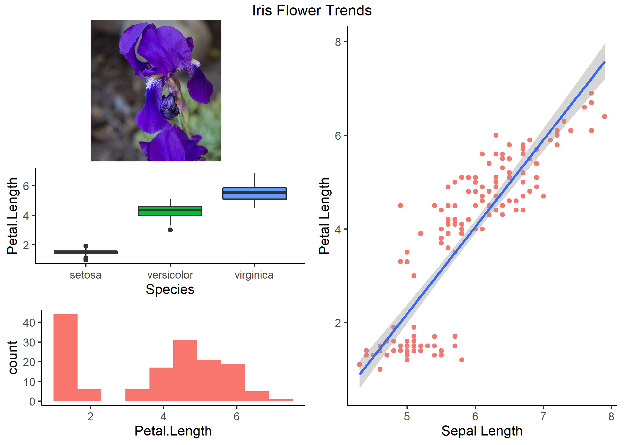
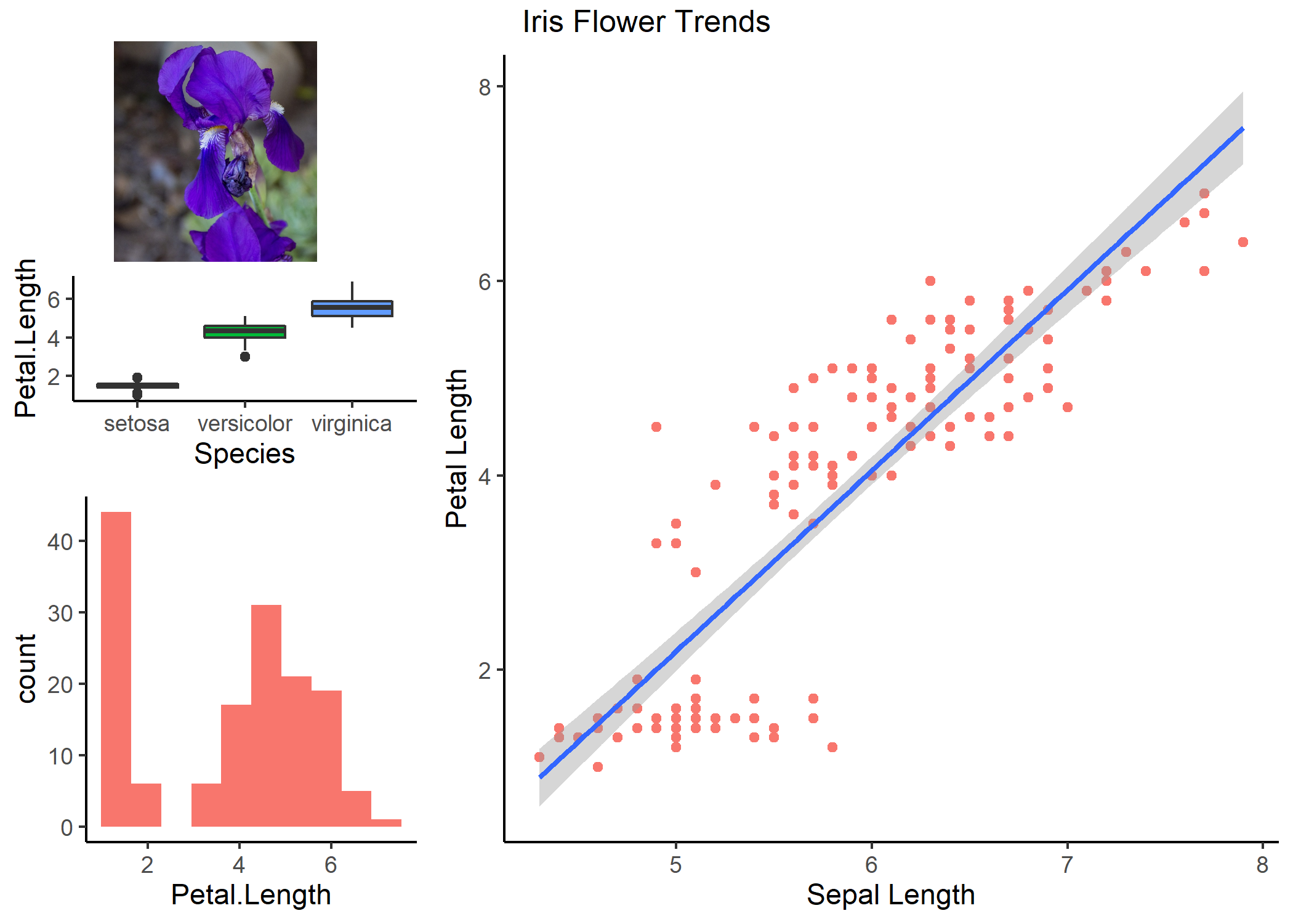
Awesome! Our scatterplot is still looking a little squished, however, and we may want to resize it to make it wider relative to the images in our first column. We can accomplish this by using the widths parameter included in grid.arrange().
# Give different columns different sizes. Use the widths parameter
grid_arrange3 <- grid.arrange(arrangeGrob(iris_img, iris_boxplot, iris_histogram), iris_plot,
                              widths = c(1,2), ncol = 2, top = "Iris Flower Trends")
With this line of code, we have told R to make to images in the second column twice as large as those images in the first column, giving us the following visual.
Great! A complementary parameter exists for height(height), and arrangeGrob() has an identical set of width and height parameters, meaning that we can also change the relative size of the grobs within our first column:
# We can perform size adjustments in the arrangeGrob() function:
grid_arrange4 <- grid.arrange(
                 arrangeGrob(iris_img, iris_boxplot, iris_histogram, heights = c(1,1,2)),
                 iris_plot,
                 widths = c(1,2), ncol = 2, top = "Iris Flower Trends")
Be careful with how much you resize the different grobs in your dataset! As you can see above, our boxplots are getting squished and hard to interpret, which brings us to another important lesson in trying to create multi-plot figures: Don’t try to include everything in a single figure! By trying to show everything at once, you may end up showing nothing at all!
Layout Matrices
However, if you’re confident in presenting several figures at once, and you want a more complex design for your grid beyond that which we’ve already discussed, then using a layout matrix may be the best thing for you. An example of what one might look like can be found below:
# Create a layout matrix
lay1 <- rbind(c(1,4,4),
              c(2,4,4),
              c(3,4,4))
In creating this layout matrix, we are establishing both the position of images as well as their relative size when we incorporate them into the grid. The grid above corresponds to the follow grid layout:
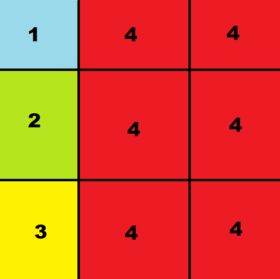
Where the box with the number ‘1’ represents the size and position of the first grob listed in grid.arrange(). If you were to provide less than four grobs using the layout matrix above, then any spaces that don’t have a grob attributed to them will simply be left blank. Let’s use the same grobs that we did above, but this time let’s use the layout_matrix parameter in grid.arrange().
# Create a grid arrangement using a layout matrix
grid_arrange5 <- grid.arrange(iris_img, iris_boxplot, iris_histogram, iris_plot,
                 layout_matrix = lay1, top = "Iris Flower Trends")
Which gives us the following plot:

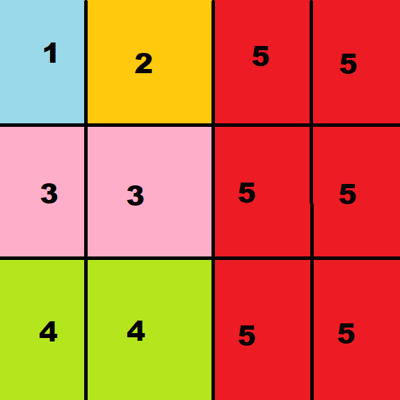
Notice how this plot is identical to one that we made earlier, but we didn’t need to use ncol,nrow, or arrangeGrob()? Pretty neat! In this sense, defining a grid layout with a layout matrix gives us near unlimited power for how we wish to present our visuals. Let’s try something a little more complicated that would be difficult to do without a layout matrix. Let’s reincorporate the table that we made earlier to have five grobs arranged according to the following matrix:
# Create a more complex layout matrix
lay2 <- rbind(c(1,2,5,5),
              c(3,3,5,5),
              c(4,4,5,5))
Remember that if we pass 5 grobs to grid.arrange(), the images will take the following size and position depending on in what order we place them in the function:
We then use the following code to create a new, five-grob figure:
# Create a grid arrangement using the more complicated layout matrix
grid_arrange6 <- grid.arrange(iris_img, iris_histogram, mean_length, iris_boxplot, iris_plot,
                              layout_matrix = lay2, top = "Iris Flower Trends")
As you can see, there are a lot of different ways to change grob position and size, and the types of images that you can insert into your figure are pretty wide and variable. On that note, we move onto the final part of this tutorial and look at creating one more kind of grob: text boxes.
Creating Informative & Engaging Text Grobs with gridtext
gridtext is essentially a more comprehensive and user-friendly version of the textGrob() function included with the grid package. If were working with the textGrob() function in the grid package, we could still generate and draw text, but it would be severely limited in how it could be used, and the text in a single grob would have to be of a single colour, font-type, or size. With this, creating a text grob is an easy task!
Basic gridtext Grob Function
We use a brief description of iris growing conditions found here on Wikipedia, and the richtext_grob() function to generate a textbox containing the description.
# Create a plain text grob using a general description of iris flowers
iris_text1 <- richtext_grob("Iris Flowers Although diverse in ecology,
                            Iris is predominantly found in dry, semi-desert,
                            or colder rocky mountainous areas.Other habitats
                            include grassy slopes, meadowlands, bogs and riverbanks.")

grid.draw(iris_text1)
Which produced the following:
Well, we can see that the text has been created and drawn. However, since our text lacks any formatting, R just writes it as a single, continuous line that goes beyond the bounds of what we can see on our computer. That’s not very helpful! We need to introduce some syntax and conventions to our text to make it more legible.
Beautifying Text Grobs
Fortunately, the two text creating functions included in gridtext, textbox_grob() and richtext_grob(), allow us to use in-text writing conventions from Markdown, CSS, and HTML in order to make a unique, customised text box with multpile different assets and features.
If you’re not too familiar with formatting in HTML, CSS, and Markdown the following table provides some of the Markdown and HTML snippets that are currently compatible with the gridtext package:
| Code | Function |
|---|---|
*italics* |
Italic Text |
**bold** |
Bold Text |
<br> |
Linebreak |
<sup>text</sup> |
Superscript |
<sub>text</sub> |
Subscript |
<span style='color:red'red text</span> |
Text Color |
<span style='font-size:12pt'text</span> |
Text Size |
<span style='font-type:Helvetica'text</span> |
Font Type |
Note: R is extremely limited in the types of font types that it can accept. While the gridtext package does include functionality for different font types, your local version of RStudio may struggle with using different fonts other than its default.
Second Note: The achilles heel of the gridtext package is that its functions cannot create plotmath images! If you want to create text grobs with mathematics or equations, you’re better off using plain a textGrob()!
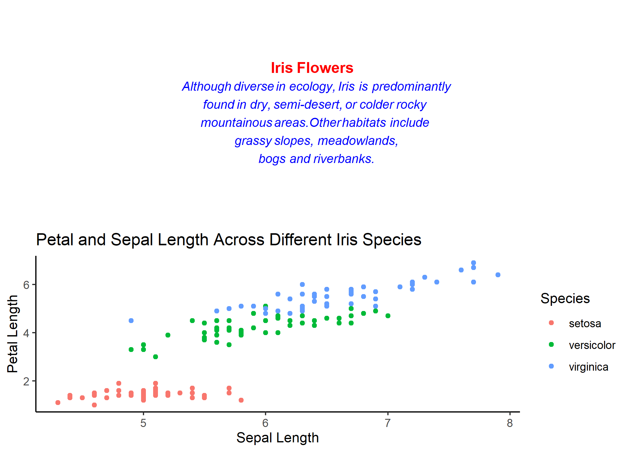
gridtext is a relatively new package that is getting updated all the time, so be on the lookout for any updates to the package that might allow for greater function and customisation. What makes richtext_grob() great is that, unlike it’s base counterpart grid.text(), you can give multiple different parameters for the text’s appearance within the text itself, meaning that you can have different parts of the text that have different colors, size, or italicisation. Let’s take the same text that we used above, a brief description of where irises grow, and customise it’s appearance and make the paragraph not go beyond the bounds of our graphics device:
# Create a grid text object that uses several text formatting attributes
iris_text2 <- richtext_grob("<span style = color:red>**Iris Flowers**</span>
                            <br><span style = font-size:10pt;color:blue>
                            *Although diverse in ecology, Iris is predominantly <br>
                            found in dry, semi-desert, or colder rocky <br>
                            mountainous areas.Other habitats include <br>
                            grassy slopes, meadowlands, <br>
                            bogs and riverbanks.*</span>")
Which creates the following grob:
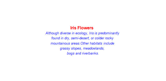
We were able to easily create a text box and define within it different parameters so that different sections of our text have different colors, sizes, and font-faces. Notice that when we used <span style> in our text, we were able to specify several text attributes at once, separating them with semicolons.
Inserting a Text Grob Into ggplot
Since this image is a grob, we can also easily insert it into a ggplot or grid.arrange() figure like we have with the previous grobs that we have created in this tutorial.
# Insert the richtext grob into a grid to demonstrate function
grid_arrange7 <- grid.arrange(iris_text2, iris_scatter1, nrow = 2)
Putting It All Together
Now, let’s combine everything that we’ve learned in this tutorial into making a single, informative figure with different grobs and visuals!
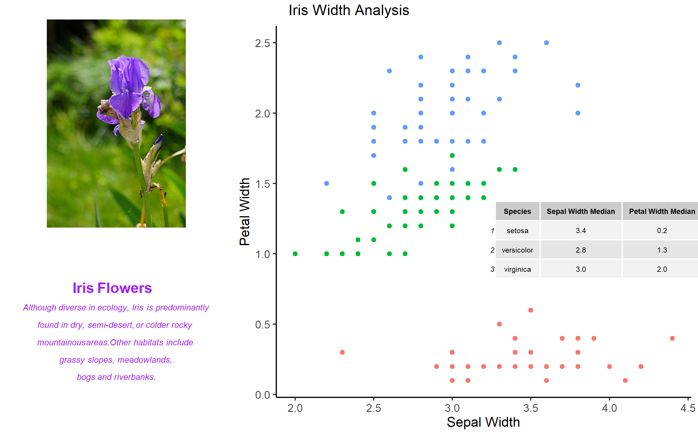
Let’s create a scatterplot in ggplot that maps petal and sepal width. Within this scatterplot, let’s insert a table that shows the mode of sepal and petal widths for each species. Let’s arrange this plot alongside an image of an iris, as well as some coloured text that briefly describes some property of iris flower (you can write any text you choose). To being working on this challenge, have a look inside the challenge folder in the tutorial repository you downloaded. There, you’ll find a starter script to keep you on track, as well as another iris image to insert into your new plot.
Before seeing the example solution below, have a go at solving it for yourself, and consult the example solution as you work through it! Work through it! It’s easy when you know how!
# Library----
library(tidyverse)
library(imager)
library(grid)
library(gridExtra)
library(gridtext)

# Import iris into working environment
iris <- iris

# Convert iris image into grob
public_iris <- rasterGrob(load.image("challenge/public_iris.jpg"))

# Create a tableGrob that presents the median values
median_width <- iris %>%
  group_by(Species) %>%
  summarise("Sepal Width Median" = median(Sepal.Width),
            "Petal Width Median" = median(Petal.Width)) %>%
  tableGrob(theme = ttheme_default(base_size = 6))

# Create the scatterplot
(challenge_plot <- ggplot(iris, aes(x = Sepal.Width, y = Petal.Width)) +
  geom_point(aes(color = "red")) +
  theme_classic() +
  theme(legend.position = "none") +
  annotation_custom(mode_width, xmin = 3.25, xmax = 4.5, ymin = .8, ymax = 1.4) +
  labs(x = "Sepal Length",
       y = "Petal Length"))

# Create the richtext grob
challenge_text <- richtext_grob("<span style = color:purple>**Iris Flowers**</span>
                            <br><span style = font-size:7pt;color:purple>
                            *Although diverse in ecology, Iris is predominantly <br>
                            found in dry, semi-desert, or colder rocky <br>
                            mountainous areas.Other habitats include <br>
                            grassy slopes, meadowlands, <br>
                            bogs and riverbanks.*</span>")

# Arrange all of the grobs together with grid.arrange()
(challenge_grid <- grid.arrange(arrangeGrob(iris_img, challenge_text), challenge_plot, ncol = 2,
                    widths = c(1,2),
                    top = "Iris Width Analysis"))
ggsave(filename = "img/challenge_grid.png", plot = challenge_grid,
width = 8, height = 5, units = "in")
Your answer doesn’t need to be exactly like what you see above, so long as your output looks roughly the same as the solution provided, I’d say you’re in a pretty good position and know what you’re doing!
Conclusion
Although grids are becoming a bit dated in their use an functionality, they still have an incredibly important role to play in everyday data visualisation and new packages are being released all the time that make them easier to use. By reaching the end of this tutorial, we hope that you’ve been able to learn how to do the following:
- Modify grobs and plots with
- Create and draw multi-object images from scratch in R
- Use viewports to allow for multi-figure data visualisation
- Use the
gridExtrapackage to create table graphical objects (tableGrobs) - Use the
grid.arrange()function to make unique, customised, multi-figure data visualisations - Use the
gridtextpackage for vibrant and unique text graphic creation
If you’re interested in learning more about grids and what they can do for you and your data visualisation, have a look at some of these links: Fun with the R Grid Package - https://www.researchgate.net/publication/267919478_Fun_with_the_R_Grid_Package Getting to Know Grid Graphics - https://www.stat.auckland.ac.nz/~paul/useR2015-grid/grid-slides.html The Grid Package - https://bookdown.org/rdpeng/RProgDA/the-grid-package.html
Also have a look at the many packages available on CRAN that you can use for a better R experience! https://cran.r-project.org/
Good luck, and merry coding!