Created by Kai Westwell
Tutorial Aims
1. Understand the basics of multivariate analyses
- Multivariate Stats Overview
- NMDS
- ANOSIM
2. Make an NMDS plot
3. Perform an ANOSIM analysis
4. Challenge
Summary
This tutorial will cover some of the basic methods in analysing multivariate data. You will learn what multivariate data is, some of the ways you can analyse these kinds of data, and then you can practice it for yourself!
Introduction
Ecological data can be complex. Often, large numbers of variables need to be studied in order to obtain an accurate picture of the system in question. This complexity can make the data hard to interpret, and even harder to analyse statistically. This tutorial will take you through the basics of understanding what multivariate data look like, and will introduce you to some of the ways we can use statistics to interpret these data. In order to transition into dealing with the wide array of ecological data you are likely to be presented with when looking at real systems, it’s important to be able to deal with complex data. And hopefully, as you take these skills forward, you will find more and more ways that you can apply multivariate stats into solving problems!
This tutorial will cover some slightly more complex topics, so if you are unfamiliar with using R, then you can find an introductory tutorial here. You can also find another Coding Club tutorial covering more information on multivariate stats, including NMDS and PCA, here.
You can get all of the resources for this tutorial from this GitHub repository. Clone and download the repo as a zip file, then unzip it.
1. Understand the basics of multivariate analyses
Multivariate Stats Overview
So what do we mean when we talk about multivariate data? Well it’s pretty much what it sounds like. Multivariate data are data that contain more than 2 response variables (although there are usually quite a few more than just 3). Multivariate statistics are where you analyse these multiple variables simultaneously. In biology these data usually come about, either from counts of species abundances in assemblages, where each species acts as a variable; or from physical properties of environments (such as temperature, pH or habitat structure).
You will already be familiar with bivariate statistical tests (where ther are 2 response variables), such as t tests and one and two-way ANOVAs. So why look at multiple variables together when you can look at them separately? When you look at 2 variables in isolation, you are ignoring the many possible interactions between these variables, and the rest of the variables that you measured in the study. Multivariate statistics allow us to look at how multiple variables change together, and avoid the confounding effects that could occur from running the analyses separately. While looking at individual variables can sometimes be enough to answer your research question, if you are aiming to look at the overall effects of all variables, multivariate stats is the way to go. This can allow us to reveal patterns that would not be found by examining each variable separately.
NMDS
NMDS plots are used to condense multivariate data into a 2d representation of those data. The distance between points on the plots shows how similar or dissimilar they are from each other, relative to the variables that you are looking at. This is great for species count data, as you can condense a lot of data down into a single, easy to read plot. NMDS stands for non-metric multidimensional scaling…sounds kind of confusing, so let’s break this down. Non-metric refers to the fact that the data is ranked, and doesn’t have a linear pattern to it. As it uses rank data, the assumptions of normality do not need to be met when running this analysis, which can be very useful when analysing species count data. Multidimensional refers to the data having multiple variables, and being condensed into a 2-dimensional (or 3d) plane. And finally scaling refers to the ratio between the real data and the 2-d representation of it generated through the nmds analysis.
Now that we understand what nmds plots are, we can look at some of the practical considerations. One of the main decisions you have to make when running these analyses is what distance matrix to use. This will decide how R calculates the distance between each point. A good choice for species data is often Bray-Curtis. This will take into account presence/absence data as well as the abundance, so it includes more information than some of the alternatives. Once we have run the analysis, we need to look at the stress value. This tells you how well the relationship between points has been represented on this 2-d plane. It is generally accepted that a stress value below 0.2 suggests the model is good, but we’ll see how this works in practice soon.
ANOSIM
ANOSIM, or analysis of similarities, is a multivariate analysis technique similar to ANOVA, where data within groups are compared to data between groups. Unlike ANOVA, however, raw data are not compared between and within groups. Instead, the data are ranked on a dissimilarity matrix as opposed to using actual Euclidean distance. This means ANOSIM analyses are non-parametric, so they don’t carry (many of) the same assumptions as a standard ANOVA (no more worrying about normality!!). But the main advantage to using ANOSIM analyses is that they can compare data across multiple groups, perfect for species count data.
2. Make an NMDS Plot
First, let’s open R studio, make a new script and load the data and packages.
# Set working directory

# Load packages
library(vegan)  # For performing the nmds
library(tidyverse)  # For data tidying functions and plotting


# Load data
barents <- read.csv("data/barents_data.csv")
The dataset we’re using here was collected from three surveys conducted in the Southwestern Barents Sea, in spring 1997-1999. The data were collected as part of the annual shrimp survey conducted by the Norwegian Institute of Aquaculture and Fisheries, however the fish bycatch was also recorded, and that is the data we are looking at here. We’re going to look to better understand the assemblages and distributions of the 57 fish species recorded in this survey of the Barents Sea, using multivariate statistics.
Now let’s make the data easier to work with. Separate the species and environmental data, and separate the environmental variables that we are interested in into ordinal groups.
# Separate environmental data and species data
barents_spp <- barents %>% select(Re_hi:Tr_spp)

barents_env_raw <- barents %>% select(ID_No:Temperature)


# Create ordinal groups for depth and temperature variables
barents_env <- barents_env_raw %>%
  mutate(Depth_cat=cut(Depth, breaks=c(-Inf, 250, 350, Inf), labels=c("shallow","mid","deep"))) %>%
  mutate(Temp_cat=cut(Temperature, breaks=c(-Inf, 1, 2, 3, Inf), labels=c("vc","c","m","w")))
Now we have arranged the data, we can perform the nmds.
# Perform nmds and fit environmental and species vectors
barents.mds <- metaMDS(barents_spp, distance = "bray", autotransform = FALSE)

# Fit environmental vectors
barents.envfit <- envfit(barents.mds, barents_env, permutations = 999)

# Fit species vectors
barents.sppfit <- envfit(barents.mds, barents_spp, permutations = 999)
Have a look at the nmds output and check the stress. Sometimes the nmds can’t represent all of the relationships between variables accurately. This is reflected by a high stress value. A general rule is if the stress value is below 0.2, the plot is generally ok.
barents.mds  # Stress value is less than 0.2, which is good.

# Shows how easy it was to condense multidimensional data into two dimensional space.
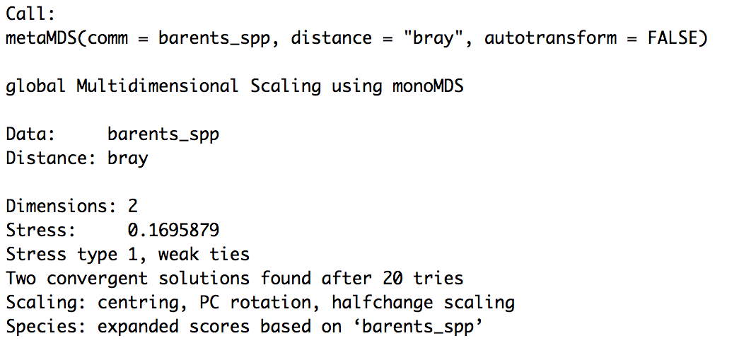
Figure 1 - Output from NMDS with low stress.
After you have performed the nmds, you need to save the outputs so we can graph it later. Here you will also group the data by the environmental variables we are interested in: depth and temperature.
# Save the results from the nmds and group the data by environmental variables
site.scrs <- as.data.frame(scores(barents.mds, display = "sites"))

# save NMDS results into dataframe
site.scrs <- cbind(site.scrs, Depth = barents_env$Depth_cat)

# make depth a grouping variable and save to dataframe
site.scrs <- cbind(site.scrs, Temperature = barents_env$Temp_cat)

# make temperature a grouping variable and save to dataframe
head(site.scrs)  # View the dataframe


# Rename Environmental Factor levels
site.scrs$Temperature <- recode(site.scrs$Temperature, vc = "Very Cold", c = "Cold", m = "Medium", w = "Warm")

site.scrs$Depth <- recode(site.scrs$Depth, shallow = "Shallow", mid = "Mid", deep = "Deep")
Take a look at the output you have saved to become familiar with the structure for future use of this dataframe.
head(site.scrs) # View dataframe
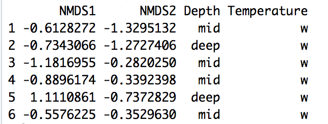
Figure 2 - Output from NDMS saved in a dataframe and grouped by environmental variables.
Now save the species specific data from the nmds analysis to a dataframe, so that we can plot this separately on the nmds plot later. Examine the dataframe so that you are comfortable with using it in later stages.
# Save species data from nmds to dataframe
spp.scrs <- as.data.frame(scores(barents.sppfit, display = "vectors"))

# Save species values into dataframe
spp.scrs <- cbind(spp.scrs, Species = rownames(spp.scrs))

# Add species names to dataframe
spp.scrs <- cbind(spp.scrs, pval = barents.sppfit$vectors$pvals)

# Add p values to dataframe so you can select species which are significant
sig.spp.scrs <- subset(spp.scrs, pval<=0.05)

# Show only significant species (using 0.05 as cutoff)
head(spp.scrs)  # View dataframe
Do the same thing with the environmental variables. This will let you plot the vector information of either the species or environmental groups, or both, on top of the nmds plot.
# Save environmental variables
env.scores.barents <- as.data.frame(scores(barents.envfit, display = "vectors"))

# Extract nmds scores of all environmental variables from envifit dataframe
env.scores.barents <- cbind(env.scores.barents, env.variables = rownames(env.scores.barents))

# Name them
env.scores.barents <- cbind(env.scores.barents, pval = barents.envfit$vectors$pvals)

# Add p values to dataframe
sig.env.scrs <- subset(env.scores.barents, pval<=0.05)

# Show only significant variables (using 0.05 as cutoff)
head(env.scores.barents)  # View dataframe
Now we can get to the fun part, plotting our nmds data! We’ll use ggplot2 for this. If you are not familiar with using this package, dont worry! We already have a tutorial covering all the basics here. Here we will use all of the same ggplot2 functions covered in this previous tutorial, so this section should be relatively straightforward.
# Basic nmds
(nmds.plot.barents <- ggplot(site.scrs, aes(x=NMDS1, y=NMDS2)) +
# Create the plot
  geom_point(aes(x = NMDS1, y = NMDS2, colour = factor(site.scrs$Depth), shape = factor(site.scrs$Temperature)), size = 2) +
  # Add site points to plot with the shape determined by temperature and colour determined by depth
  coord_fixed() +
  theme_classic() +
  theme(panel.background = element_rect(fill = NA, colour = "black", size = 1, linetype = "solid")) +
  labs(colour = "Depth", shape = "Temperature", title = "Does Fish Species Composition Change at\n Varying Water Depths and Temperatures") +
  # Add legend labels
  theme(legend.position = "right", legend.text = element_text(size = 12), legend.title = element_text(size = 12), axis.text = element_text(size = 10)) # Add legend
)
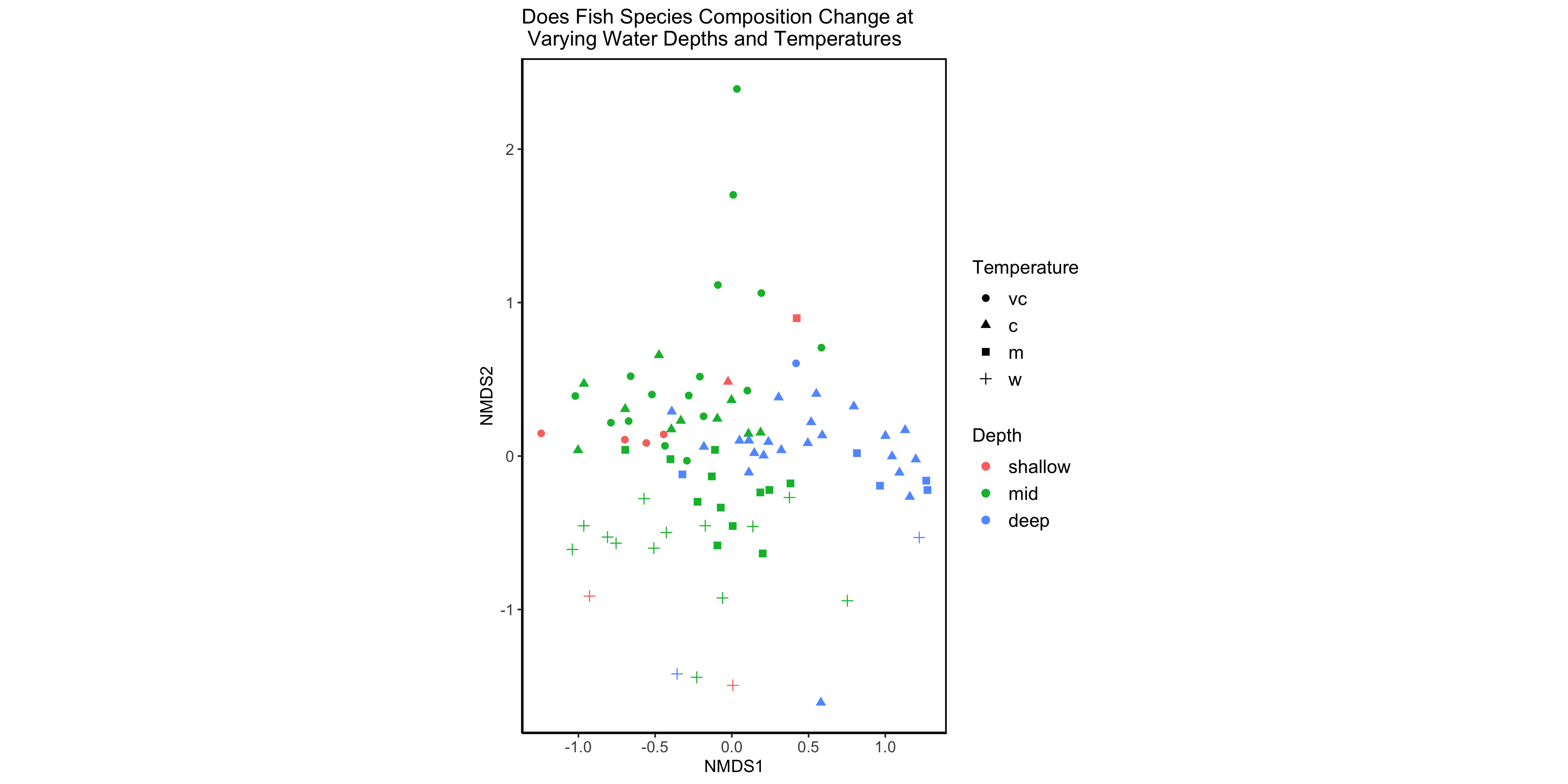
Figure 3 - Basic NMDS plot.
And here we have an nmds plot! We can see that there are some different groupings going on here, with some samples being found in warmer temperatures or greater depths, for example. But we don’t know which species these groups relate to…it’s lucky we saved the species data from the nmds then!
Let’s add an overlay with species vectors.
# Add species vector arrows
(nmds.plot.barents.2 <- nmds.plot.barents +
  geom_segment(data = sig.spp.scrs, aes(x = 0, xend=NMDS1, y=0, yend=NMDS2), arrow = arrow(length = unit(0.25, "cm")), colour = "grey10", lwd=0.3) +
  # Add vector arrows for significant species
  ggrepel::geom_text_repel(data = sig.spp.scrs, aes(x=NMDS1, y=NMDS2, label = Species), cex = 3, direction = "both", segment.size = 0.25)
  # Add labels for species (with ggrepel::geom_text_repel so that labels do not overlap)
)
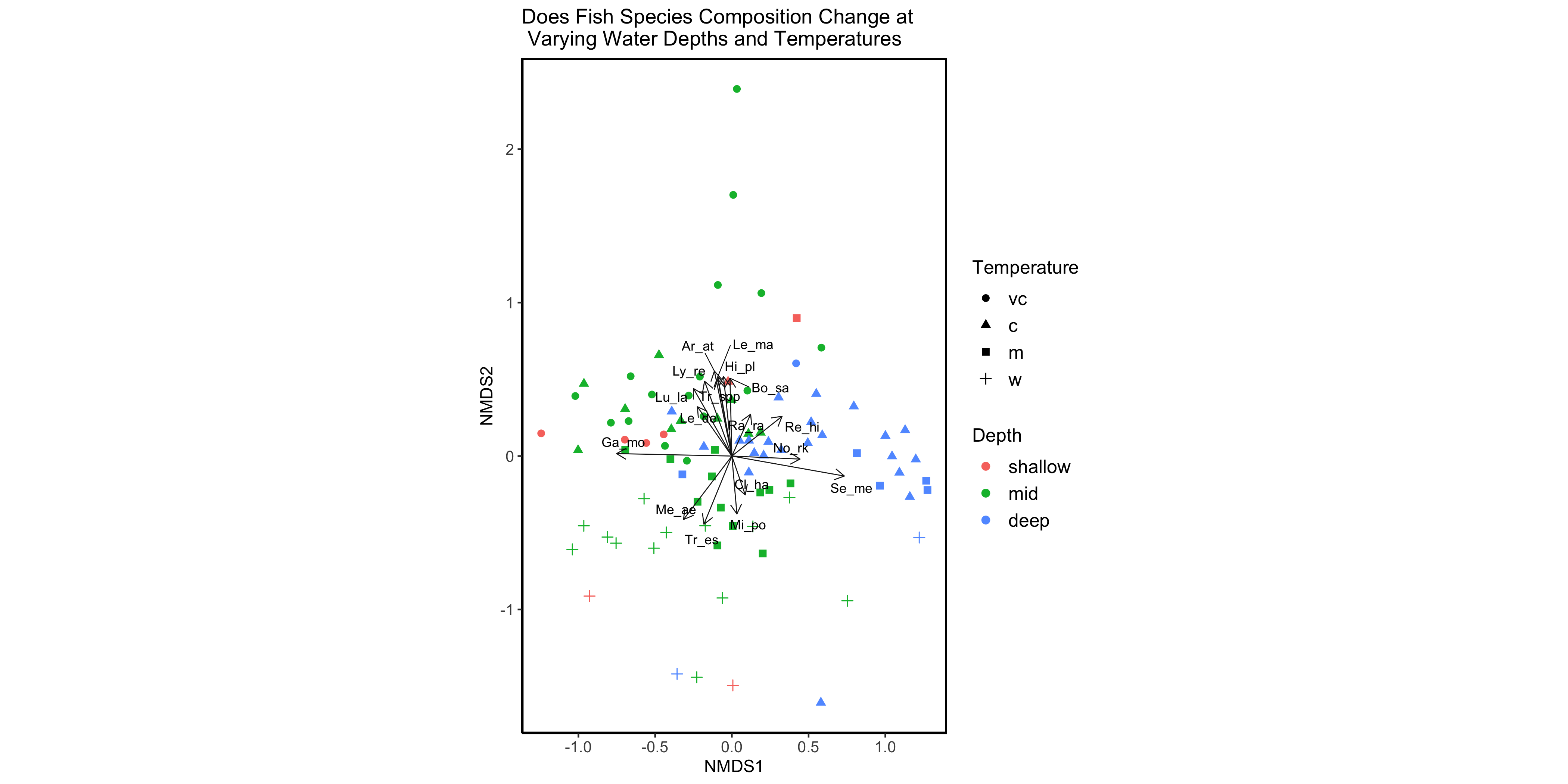
Figure 4 - NMDS plot with species vector overlay.
Great! Now we can see certain species group more in warmer water, or in colder water. We can also see how strong these relationships are based on the length of the arrows. While we can see that some environmental groupings exist, we may want to get a clearer idea of the directions these are acting in by overlaying the environmental nmds data that we also saved earlier. Let’s include all of the measured variables just so that we can see what datasets with lots of variables would look like. Pick whichever is your favourite to save using ggsave.
ggsave(filename = "filepath/filename.png", name_of_plot, height = 7, width = 14)

# Change the filename to the filepath you want it to be saved to / whatever you want to call it.
# Then add the file extension to the end.
# Now you can include the name of the plot you want to save (eg. nmds.plot.barents.2).
# Then save it with whatever dimensions you prefer.
You might also want to make some changes to it to make it look nicer, for example, renaming the axes or changing the colours. If you haven’t been through the data visualisation tutorial yet, you can find it here.
# Add environmental variable vector arrows
(nmds.plot.barents.3 <- nmds.plot.barents +
  geom_segment(data = sig.env.scrs, aes(x = 0, xend=NMDS1, y=0, yend=NMDS2), arrow = arrow(length = unit(0.25, "cm")), colour = "grey10", lwd=0.3) +
  # Add vector arrows of significant environmental variables
  ggrepel::geom_text_repel(data = sig.env.scrs, aes(x=NMDS1, y=NMDS2, label = env.variables), cex = 4, direction = "both", segment.size = 0.25)
  # Add labels
)
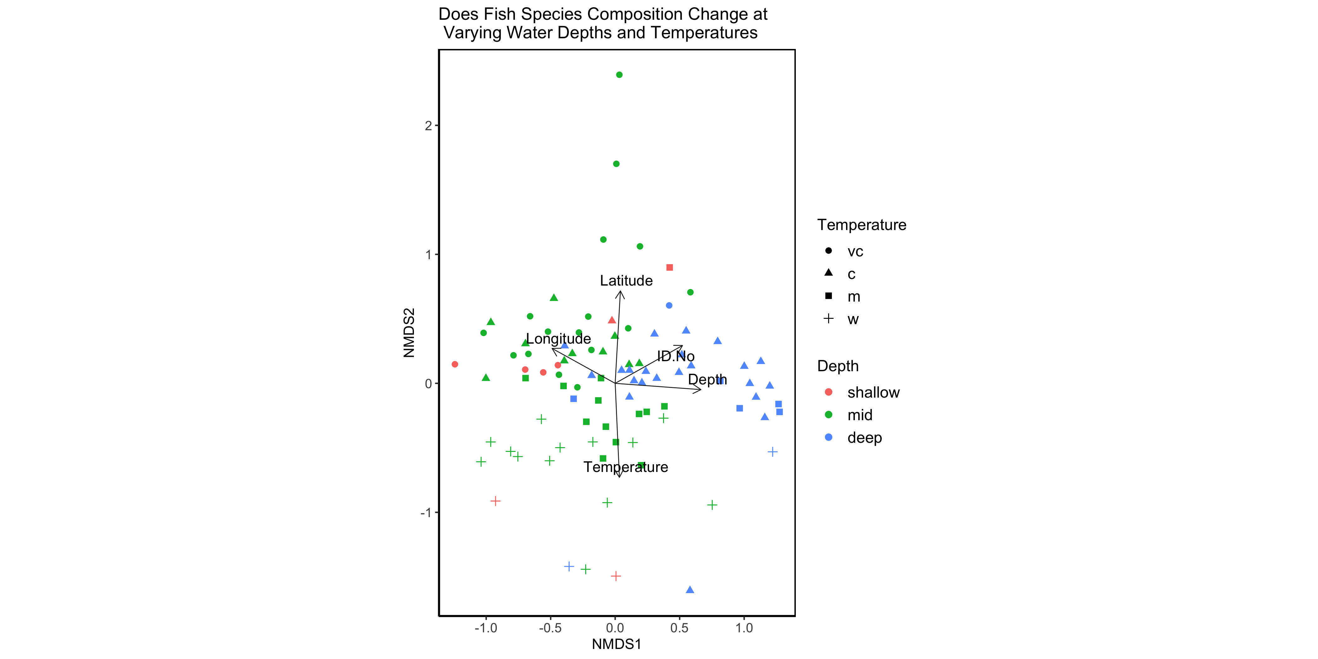
Figure 5 - NMDS plot with environmental vector overlay.
3. Perform an ANOSIM analysis
First, we’ll turn the species data into a matrix so that the ANOSIM can process the data.
mat_bar_spp <- as.matrix(barents_spp)
Now we can run the ANOSIM, first looking at the depth grouping.
# ANOSIM with depth grouping
bar_depth <- anosim(mat_bar_spp, barents_env_raw$Depth, distance = "bray", permutations = 9999)

bar_depth

# ANOSIM significance is less than 0.05 so it is significant.
# R statistic is relatively low, suggesting the groups are similar to each other.
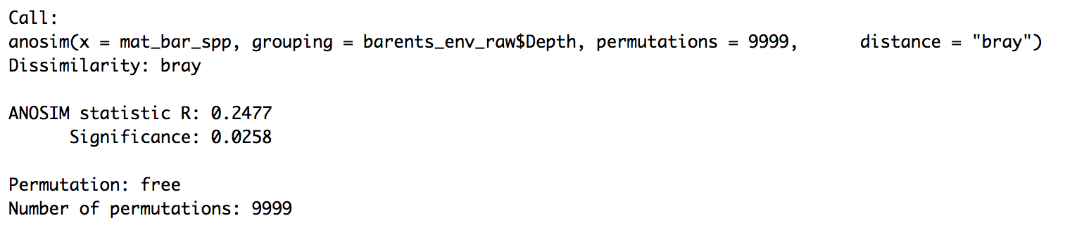
Figure 6 - ANOSIM looking at depth. Significant and low r statistic.
This shows that there is a statistically significant difference between species based on depth, as the significance value is below 0.05. However, this difference isn’t particularly strong with an r statistic of around 0.2.
And now let’s run the ANOSIM of the species grouped by temperature.
# ANOSIM with temperature grouping
bar_temp <- anosim(mat_bar_spp, barents_env_raw$Temperature, distance = "bray", permutations = 9999)

bar_temp

# Significance means this looks good too.
# And relatively low R statistic suggests similarity between groups.
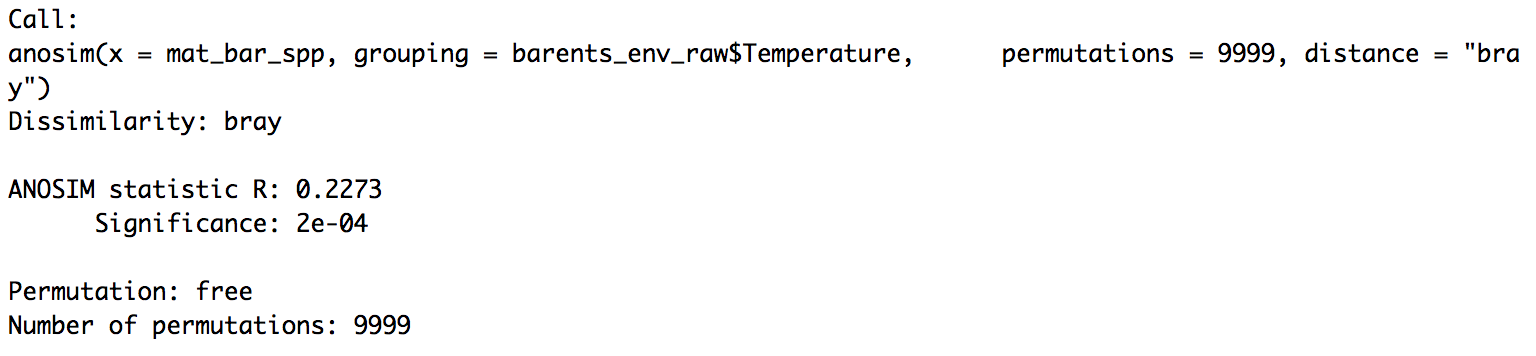
Figure 7 - ANOSIM looking at temperature. Significant and low r statistic.
This is also significant, and has a similar r statistic to depth. However, this is strong enough to infer that there is a difference between groups, even though it isn’t the strongest difference. This is backed up by the low stress level in the NMDS, suggesting that the model is accurate.
4. Challenge
So…now you know how to run NMDS and ANOSIM analyses on multivariate data, as well as the situation in which these tests would be useful. So now it’s your turn to try it out! Use the code below that groups the data by location (latitude and longitude), and test to see if species are grouped by one or both of these variables. Remember to also check that these groupings are statistically significant, and how strong they are.
barents_env_chal <- barents_env_raw %>%
  mutate(lat_cat=cut(Latitude, breaks=c(-Inf, 72, 74, Inf), labels=c("south","centre","north"))) %>%
  mutate(long_cat=cut(Longitude, breaks=c(-Inf, 23, 30, Inf), labels=c("west","centre","east")))
Steps:
- Perform an nmds and fit the environmental and species data.
- Save the results from the nmds and then group the data by the variables you are interested in.
- If you want to look at environmental factors, species or both on the nmds plot, then save these. If you don’t want to add either of these to your plot, then move onto the next step.
- Create your nmds plot and make it look nice.
- Test whether there’s a statistically significant difference between Barents Sea fish communities and your environmental variables.
- Enjoy being able to perform multivariate analyses!
Summary
Congratulations! You are now able to perform two different multivariate statistical tests. But there are so many more to learn! A further test you could perform on this data is an indicator species analysis, to see which species are found statistically more abundantly in one group versus the other. Or, if you didn’t want to group the environmental variables, instead keeping them as continuous scales, you could try a mantel test. You could also look into PCA, MANOVA, rarefaction and a range of other tests, so keep an eye out for future tutorials on these subjects.
But for now, relax and enjoy being able to explore the factors affecting fish communities in the Barents Sea.
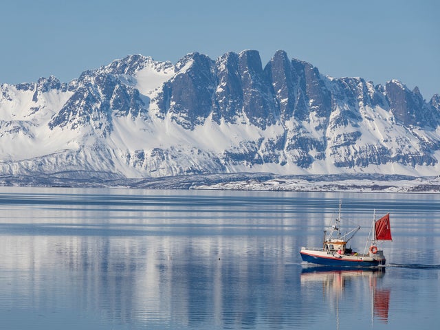
Figure 8 - The Barents Sea
Now you should know:
- What multivariate statistics and data are
- The situations in which you could use NMDS and ANOSIM
- How to run NMDS and ANOSIM analyses
And keep practicing these skills by looking for other multivariate datasets to apply these tests to. The more you practice, the more confident you will feel in the world of multivariate stats.
If you have any questions about this tutorial, send me an email at s1727718@ed.ac.uk.
See repository for references.